Novato CA
ACCJC
Besties, Education & Fine Arts, Nonprofits
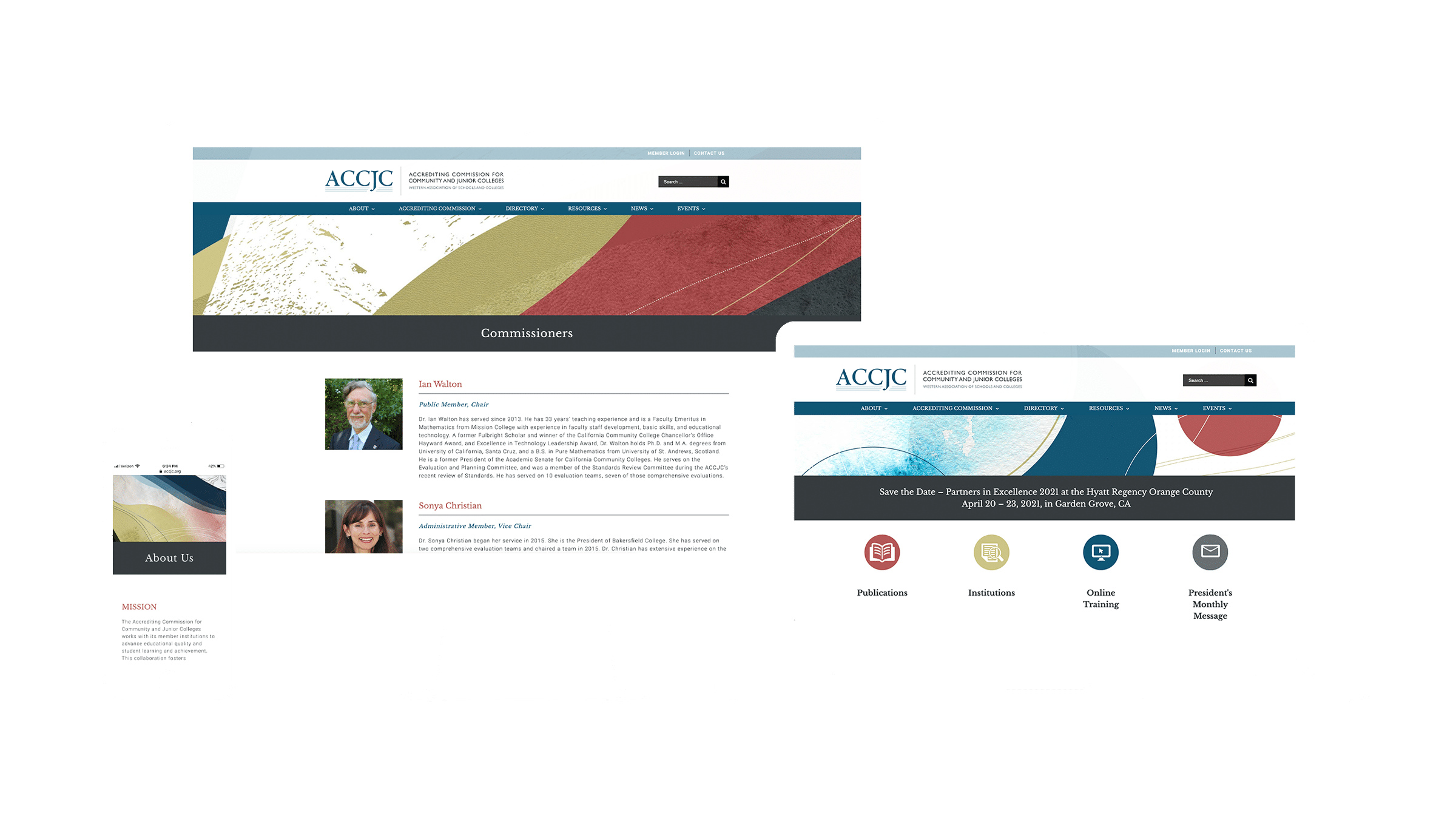
ACCJC sets quality standards for accrediting junior and community colleges in California. They hold themselves to the highest standards of integrity and fairness, and needed a brand and a website to do their work justice and differentiate themselves as free thinkers in a rather buttoned up field.
Services

Setting
The Bar
When you are a regional association of academics that literally makes the rules, you must be fair, credible, and reliable. ACCJC’s presentation needed to show professionalism, maturity, and reliability for their review by the U.S. Department of Education while also offering a creative, expansive brand style for internal stakeholders breaking free of the stodgy academic stereotype.
Staying Power
Lasting Value
Like a fractal, each section of the high res digital canvases Two Hats made for ACCJC holds the structural and stylistic characteristics of the whole. Abstract shapes and strong circular forms contribute an imaginative yet grounding presentation. Red, blue, and gold signal a Japanese influence. These textured illustrations can be cropped and reused to generate unique and consistent branded materials, providing lasting value for any occasion.

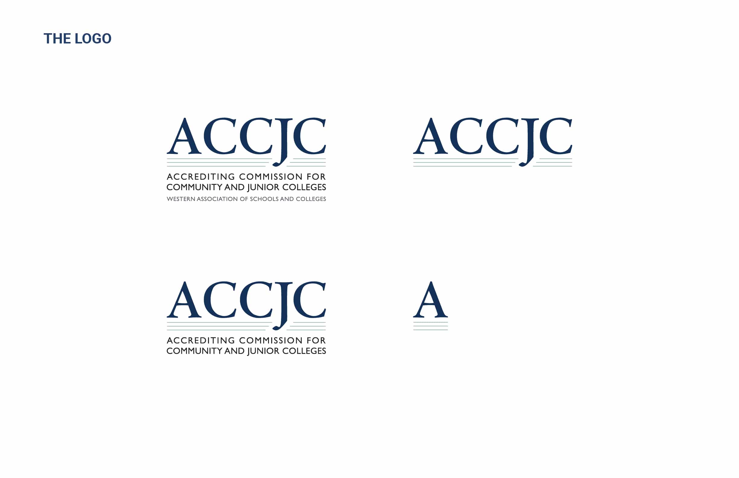

Yearly Rebranding for
A Flagship Conference
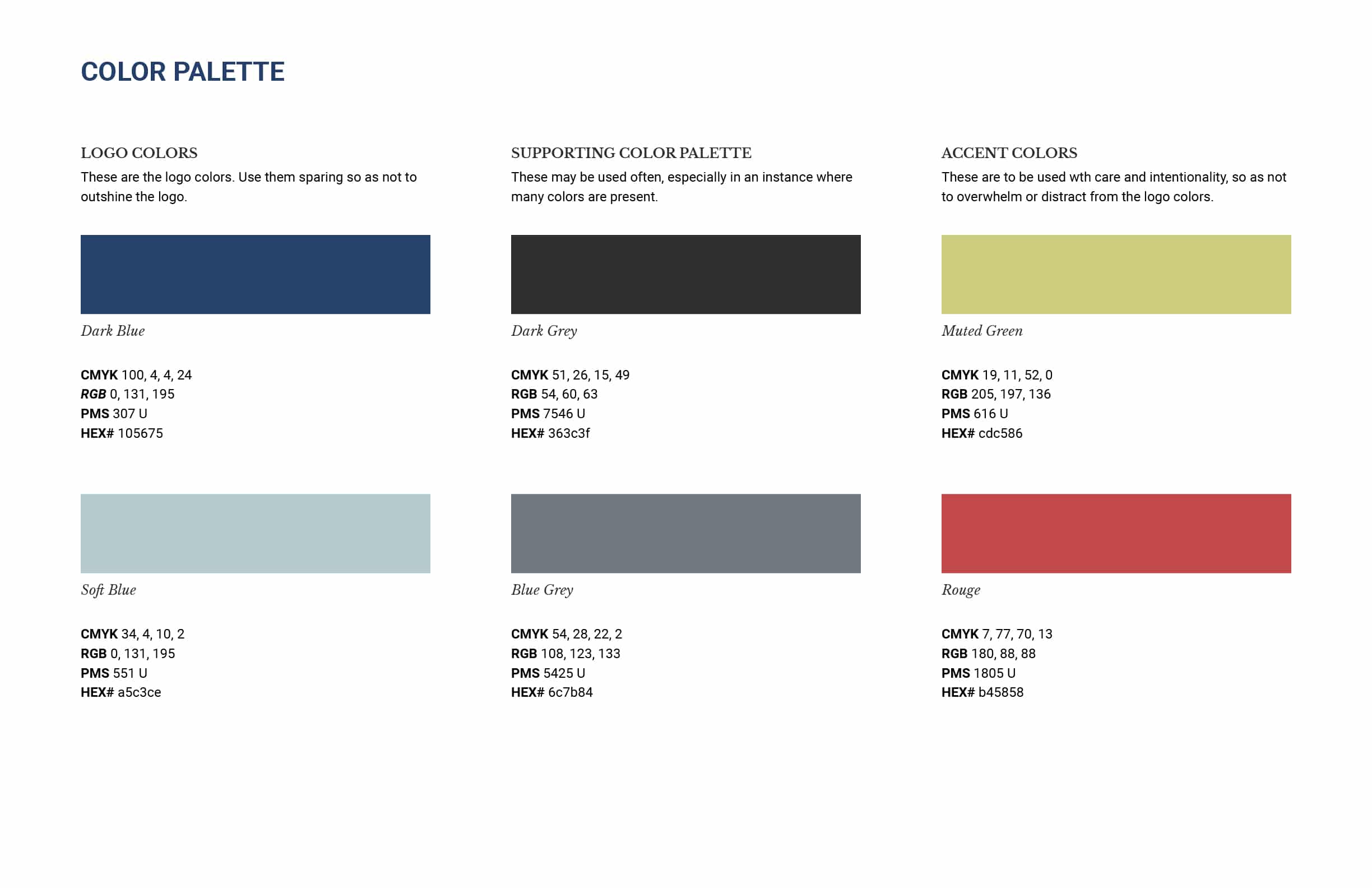
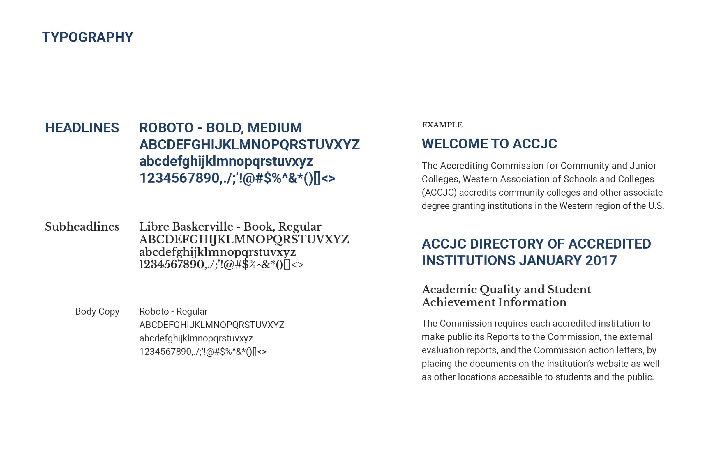
Each year ACCJC delights us with original ideas for rebranding their annual conference materials and website. Making playful symbolic themes is a breeze when you have a strong parent brand, clear style guide and collaboration guidelines, and a memorable je ne sais quoi. Thanks, ACCJC, for being one of our favorite organizations to work with, and for bravely challenging stifling stereotypes.
